Re-branding. It’s all in the logo.
Share
As part of the new branding I’ve been thinking about options and feelings towards our woven garment labels. As our customers know, the woven labels are black with elegant white font and are sewn on with black thread. They are neat, polished and reflect the quality of the brand.. but it’s time for a refresh and rebirth.
The current top idea is to sew the labels on with a zig zagging stitch in the main colour of each new print collection, so this will change each season and help identify each range moving forward. The label will be white or off white and be a great blank canvas to the decorative detailing which shows our attention to detail, love of pattern and individuality.
Garment sampling of the new collection starts next week so I will be sure to share images of the label installation.
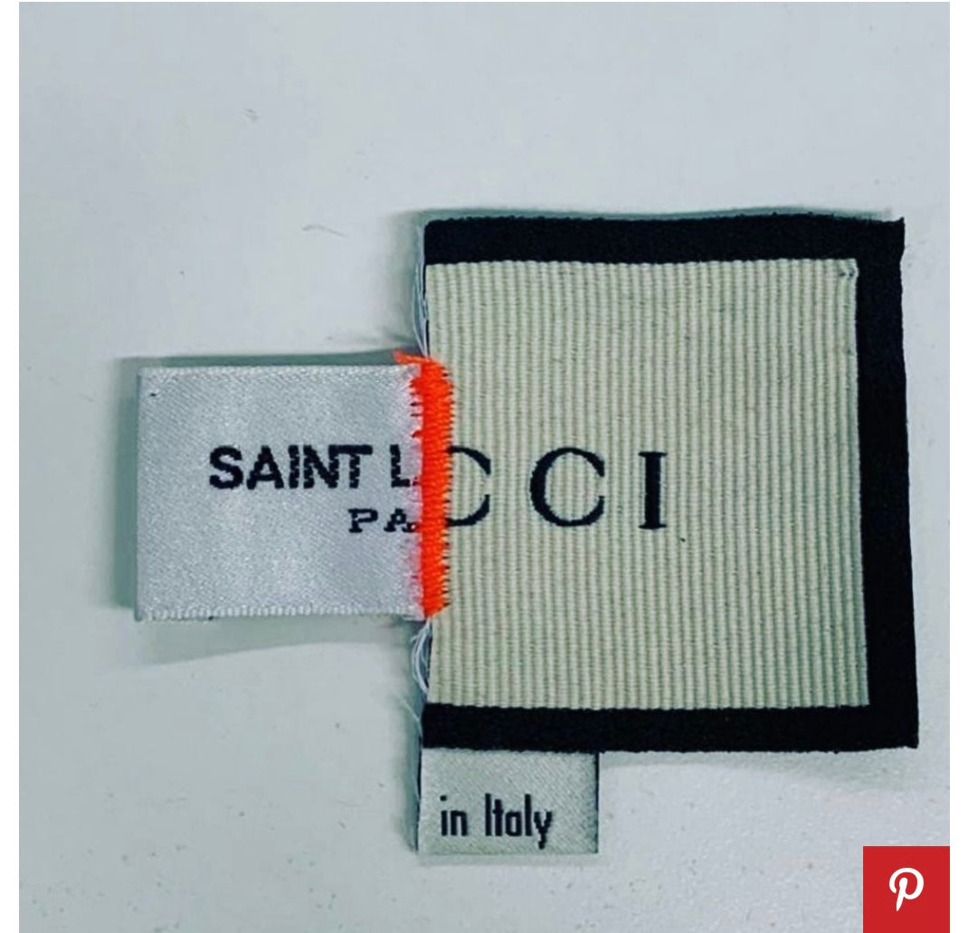
There are some examples of great brands who think differently about their visual identity. 
