Day 39. Yves Klein Blue
Share

 Have you ever wondered about who gives colours their names? I’m talking about the designers of great brands that come up creative monikers for paint charts (@farrowandball or @dulux). I particularly like their #lulworthblue, #charlotteslocks red and #cookingapple green. Even the name conjures up visualisations and relatability. It’s so clever that Farrow and Ball have even trademarked these names for their colours!

I’ve been choosing names for my colourways and been debating what to call each one. After finalising a beautiful rich blue design I was confused as to what to go with. A bright but classic colour which wasn’t royal blue but more tropical than that I suppose. Nothing seemed to fit! I have gone with Midnight Blue as it has got a few darker shades within it, but it is TBC..
You could say it was a #yveskleinblue.
Here’s a definition..

Yves Klein Blue is a deep blue hue first mixed by the French artist Yves Klein. Yves Klein Blue’s visual impact comes from its heavy reliance on ultramarine, as well as Klein's often thick and textured application of paint to canvas.
I love that Klein’s works became so iconic that a colour was named after him and to this day I immediately know the colour it’s talking about!
Share any images of this blue around your house.
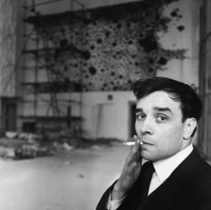
Some images of Yves Klein in action, as well as recognisable work from #anishkapoor

