Case Study on Craig Green's Floral Collection
Share
An Extraordinary Collection of Colliding Inspirations
Bedsheets, Backwards Records and Harvest Gold: Inside Craig Green’s Psychedelic Spring/Summer 2026
Craig Green’s Spring/Summer 2026 collection began with the Beatles—not their look, but their superhuman pace: two albums a year for a decade. It was, he said, a meditation on youthful potential and the pursuit of something beyond human.
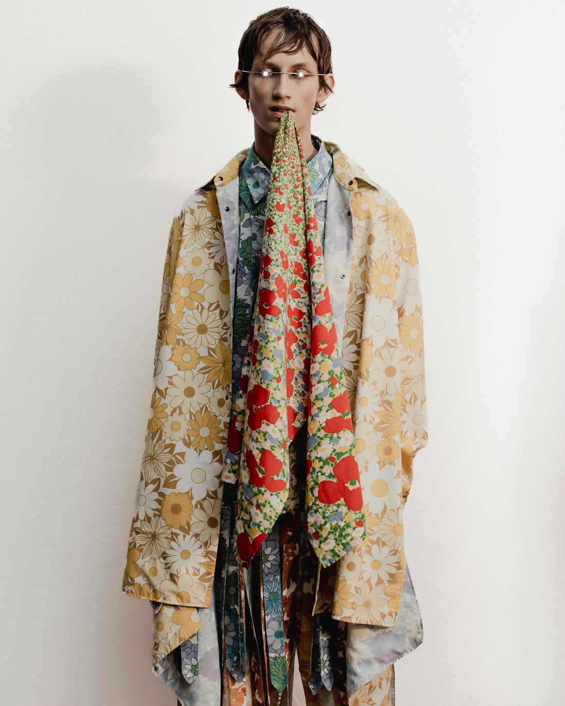
That spirit unfolded through psychedelic florals, vintage bedsheets sourced from charity shops, and an exploration of intimacy, discomfort, and aesthetics Green found “challenging, even gross.” He leaned into unease and nostalgia—from records played backward for hidden meanings to 1970s colour palettes soaked in harvest gold, avocado green, and burnt orange.

Green’s fascination with colour linked childhood memory (his mum’s green bathroom suite) to sensory myth: he painted his own bedroom yellow after reading it caused arguments and made babies cry. It brought to mind The Yellow Wallpaper, Charlotte Perkins Gilman’s 1892 novella in which wallpaper becomes a metaphor for suffocating societal constraint.
And then came the finale. The technicolour dreamcoats—cheap-and-cheerful, multilayered prints bordering on Lilly Pulitzer psychedelia—exploded onto the runway. He called it “trippy intensity.” Rightfully so. The coats captured both Green’s singular design voice and the shared mood of optimism swelling across the season. Romantic, yes—but also radical.
This wasn’t just a standout show. It was a seismic one. Mic dropped.

